
Table of Contents 16 sections
- What Is E-Commerce Homepage Design?
- Why Does the Homepage Matter?
- Which Sections Should the Homepage Have?
- In What Order Should Homepage Sections Be Arranged?
- How Do You Arrange the Homepage Showcase?
- How Much Is the Homepage-to-Product Click-Through Worth?
- How Should the Homepage Look on Mobile?
- How Do You Keep the Homepage Fast?
- How Do You Keep the Showcase Fresh with a Campaign Calendar?
- How Do You Manage the Showcase on Multilingual and Multi-Country Sites?
- How Is the Homepage Complemented by Menus, Announcements and Custom Pages?
- Common Mistakes in Homepage Design
- How Do You Audit the Homepage?
- How Do You Measure Homepage Success?
- How Do You Manage the Homepage Showcase with Faprika?
- Frequently Asked Questions
The place where visitors first meet your site is most often the homepage, and within a few seconds they look for the answers to two questions: what is sold here, and how do I get to what I'm looking for? E-commerce homepage design and showcase management come down to choosing the sections that answer these two questions clearly, putting them in the right order, preparing them for mobile and fast loading, and keeping them up to date as campaigns change. A homepage that looks good but doesn't lead visitors to products is like a store with the lights on in the window but the door locked.
In this guide, we explain which sections the homepage consists of, in what order they should be arranged, how to prepare the main campaign image, how to set up category entries and the best sellers section, what to watch for on mobile and speed, how to keep the showcase up to date with a campaign calendar, and how to measure the result. Of the two tools in the post, one lets you calculate what increasing your homepage's click-through rate to products would earn you, and the other lets you audit your current homepage with eight questions.
What Is E-Commerce Homepage Design?
E-commerce homepage design is the selection, ordering and visual arrangement of the sections on your site's entry page. The goal is to welcome the visitor, explain what the store sells and direct them to a category or product page. Showcase management, in turn, covers adding, sorting, updating and removing the sets of products and images in these sections, that is, the showcases.
Why Is the Homepage a Distribution Point?
The homepage is usually not where the sale happens, but where the path to the sale begins. Visitors come here less to buy a product than to find their way. That is why the homepage's job is to direct before it persuades: paths to categories, best sellers, campaigns and the search box should be clear.
| Concept | What does it tell you? | Example |
|---|---|---|
| Home | The site's entry page and distribution point | Campaign, categories, best sellers |
| Storefront | A set of products or images featured on the homepage or a category page | New arrivals showcase |
| Slider (sliding image area) | The top area where several campaign images are shown in turn | Seasonal campaign image |
| Banner | An image that carries a single message and link | Category promotion image |
Why Does the Homepage Matter?
The homepage is the first stop for most visitors who arrive through brand searches, ads or by typing the address directly. Confusion here means a visit lost before the visitor ever reaches a product page.
- It sets the first impression: If what the store sells isn't clear on the first screen, the visitor goes back.
- It shortens the path to the product: The right category and best-seller entries reduce the time visitors spend searching.
- It makes the campaign visible: If a new campaign doesn't stand out on the homepage, most visitors never see it.
- It builds trust: Information about returns, shipping and secure payment eases the hesitation of first-time shoppers.
- It welcomes returning customers: New arrivals and current campaigns show that the site is alive.
Which Sections Should the Homepage Have?
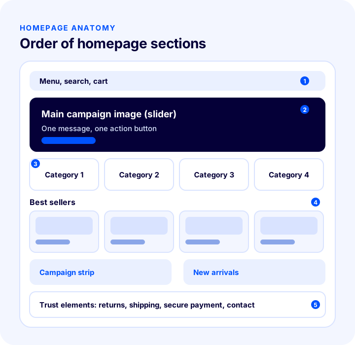
On most e-commerce sites, the homepage consists of six core sections: a menu and search, a main campaign image, category entries, best sellers, new arrivals or a campaign strip, and trust elements. Not every store needs all of them; a store with few products can shrink the category entries, while a store selling in a single category can put the emphasis directly on best sellers.
1. Main Campaign Image (Slider or Banner)
The image in the top area is the largest and most looked-at part of the site, so it should carry a single clear message and a single action. The text on the image should be short, the button prominent, and the page it leads to directly relevant to the topic.
- One message: Discounts, the new season and free shipping aren't announced in the same image; one is chosen.
- The right destination: The image should lead to the campaign category or the campaign products; an image that goes back to the homepage or nowhere damages trust.
- Few images: If several images will rotate, keep the number low; visitors usually see only the first one.
- Readable text: Text should not fall on the busy part of the image and should stay a readable size on mobile too.
2. Category Entries
Category entries are shortcuts that take the visitor to the right shelf. Instead of repeating every category in the menu, the most searched or best-selling main categories are shown in image boxes. Each box carries a clear name and a single link.
3. Best Sellers
The best sellers section is a safe starting point for an undecided visitor, because a product that others buy often doesn't look risky. The section can be selected manually or built from sales data; in both cases the products must be in stock.
4. New Arrivals and Campaign Strip
For customers who return to the site regularly, the most valuable section is the one that shows what has changed. A new arrivals showcase makes the site feel current. The campaign strip is a smaller but visible reminder, independent of the main image.
5. Trust Elements
Return terms, shipping information, secure payment and contact channels should appear in the lower part of the homepage in a short, linked form. This information answers the questions first-time visitors ask; the links should go to detail pages.
| Section | Its job | Common mistake |
|---|---|---|
| Main campaign image | Delivering today's message | Too many messages, too many images |
| Category entries | Taking the visitor to the right shelf | Repeating everything in the menu |
| Best sellers | Offering a safe choice | Showing an out-of-stock product |
| New arrivals / campaign | Showing returning customers what's new | A showcase that doesn't change for months |
| Trust elements | Easing hesitation | Generic statements with no links |
In What Order Should Homepage Sections Be Arranged?
Sections should be arranged in the order the visitor will need them as they scroll down: first the store's message, then finding the way, then choosing, then trust. The order matters more than how long the page gets, because a significant share of visitors never scroll to the lower sections.
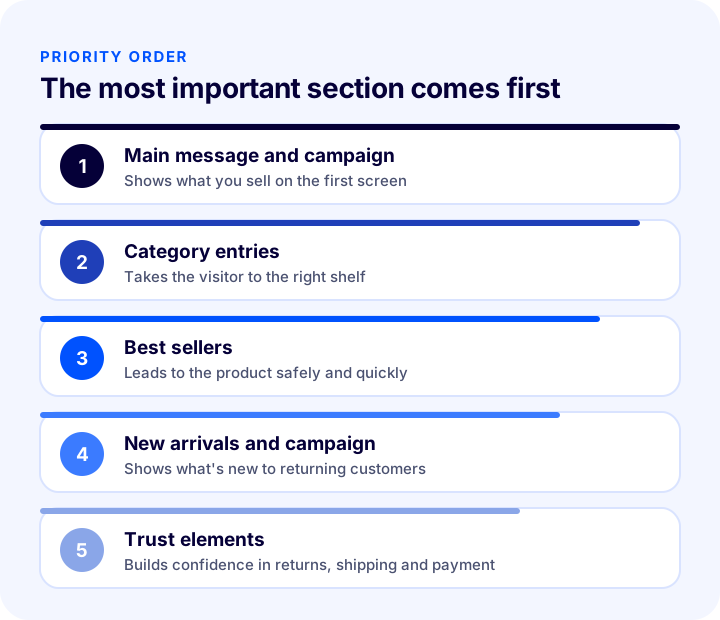
- Main message and campaign: What the store sells and today's featured offer are visible on the first screen.
- Category entries: The visitor goes to the shelf they want with a single tap.
- Best sellers: Safe products are offered to the undecided visitor.
- New arrivals and campaign: Returning customers are shown what's new.
- Trust elements: Returns, shipping and payment assurances are completed at the end of the page.
What Should Be Visible on the First Screen?
The first screen is the area visible without scrolling when the page opens. It should contain what the store sells, the main campaign, and the way to search and the menu. Filling the first screen with an ad image and leaving the category entries further down loses visitors who are looking for a product.
How Do You Arrange the Homepage Showcase?
Arranging a showcase means deciding which product or image is shown in which area, in what order and in which language. The arrangement is done from the showcase and slider management screens of the e-commerce panel and often requires no code.
Showcase Selection: Manual or Rule-Based?
Choosing featured products manually gives you control but takes effort; showcases built automatically from sales data or date added stay current. For most stores, a good balance is managing campaign and brand showcases manually and best sellers and new arrivals by rule.
Showcase Layout: Simple, Side Image or Multi-Image
Showcases can be presented in different layouts: a simple row made up only of products or images, a layout with a fixed promo image on one side and sliding products on the other, or several images laid out horizontally. The fixed image beside the sliding products can direct to the relevant category, so product display and category promotion work together.
Showcase Order and Count
Every showcase takes up space on the homepage and splits the visitor's attention. That is why the number of showcases should be limited and the most important ones should sit at the top. Showcases further down are seen less, so adding more of them rarely pays off.
Okumanızı öneririzDönüşüm Oranı Optimizasyonu (CRO) Nedir?How Much Is the Homepage-to-Product Click-Through Worth?
The most basic measure of homepage success is what share of visitors move on to a product page, because sales begin on the product page. Even a small increase in this rate brings extra product page visits and therefore extra orders. The tool below calculates roughly how many extra product page visits and extra orders you would get if you raised the click-through rate to your target. The values are examples; enter your own figures.
The main lesson the tool shows is that a small improvement on the homepage is a gain that repeats every month. The extra order figure is only an estimate; factors such as visitor quality, the product page and price change the result. Even so, it is a good yardstick for ranking which improvement is worth the effort.
How Should the Homepage Look on Mobile?
On mobile, the homepage is not a shrunken version of the desktop; it is a page designed separately. Because the screen is narrow, fewer sections are visible at once, so order and simplicity matter even more on mobile.
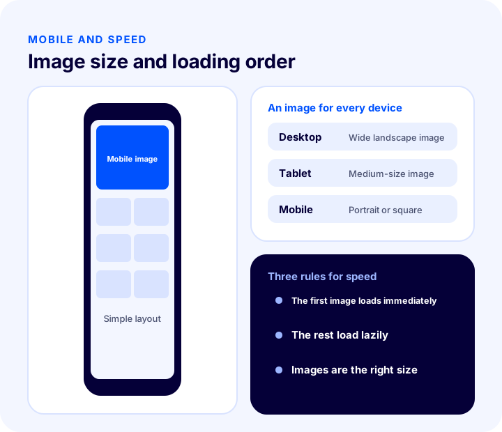
- Device-specific image: A wide image made for desktop gets cropped on mobile or its text becomes unreadable; preparing separate images for desktop, tablet and mobile is the healthiest approach.
- Touch-friendly areas: Buttons and category boxes should be large enough to tap easily with a finger.
- Fewer sections: Each section takes more space on mobile, so keep the number of sections low.
- Easy scrolling: Horizontally sliding showcases should be easy to swipe with a finger and should not block the page's vertical scrolling.
- Search is reachable everywhere: On mobile, visitors turn to search more than to the menu; the search box should be visible.
How Do You Keep the Homepage Fast?
The homepage is often the most image-heavy page on the site, which makes it the easiest to slow down. Large images, many showcases and heavy sliding areas lengthen the load time; on a slow page, visitors may leave without seeing the content. Speed is also taken into account when search engines evaluate a page.
Image Size and Format
The image itself should not be larger than the size it is displayed at. An oversized image is downloaded without giving the visitor any benefit. Modern, lightweight image formats should be preferred and images should be compressed.
Lazy Loading
Lazy loading means that images below the fold are not loaded until the visitor scrolls to them. The main image on the first screen should load immediately, while the showcases below should come in as needed. Lazy-loading the image on the first screen backfires and delays the first view of the page.
Sliding Areas and Showcase Count
Every extra image and every sliding area adds load to the page. A small number of well-prepared images is both faster and more effective than many automatically rotating ones. Keep the number of showcases that display products as slides limited too.
Recommended readingHow to Optimize Product Images? Size, Format (WebP), File Name and Alt Text in E-commerce: A Practical Guide Okumanızı öneririzE-Ticarette Site Hızı Neden Önemlidir?How Do You Keep the Showcase Fresh with a Campaign Calendar?
The most common homepage mistake is leaving the image in place after the campaign has ended. The image of an ended campaign both damages trust and takes the visitor to an invalid page. The solution is to manage the showcase with a campaign calendar.
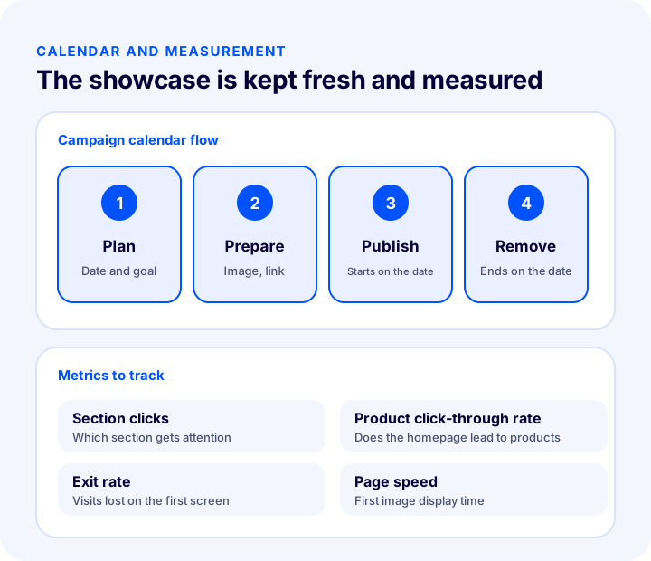
- 1. Plan: Set the campaign dates and goals in advance.
- 2. Prepare: Have the images, links and product lists ready before the campaign.
- 3. Schedule: If possible, enter the start and end dates of the image and the announcement in advance, so you don't have to wait to remove them by hand when the campaign ends.
- 4. Remove: When the campaign ends, take the image, link and announcement offline or replace them with new ones.
- 5. Measure: At the end of the campaign, record which image and which section got attention.
What Changes Are Needed Beyond Campaigns?
The showcase doesn't change only for campaigns. It should also be reviewed when a new product arrives, when stock runs out, when the season changes or when you want to feature a category. A short weekly check habit catches most mistakes before they happen.
How Do You Manage the Showcase on Multilingual and Multi-Country Sites?
If you sell in more than one language or country, showing every audience the same homepage is often not the best choice. Each country has a different culture and campaign habits; an image that works in one country may not have the same effect in another. Showing separate showcases and banners by language or country lets you give each audience a fitting message.
- Language-specific image: The text on the image should match the language of the site.
- Country-specific campaign: A campaign that is valid in one country should not be shown in another.
- Product selection: A product that sells well in one country may not get the same interest in another.
How Is the Homepage Complemented by Menus, Announcements and Custom Pages?
The homepage doesn't consist only of showcases; menus, announcements and information pages also shape the visitor's path. These parts should not contradict the showcase and should support the same message.
- Menu: The main menu is the permanent route by which visitors reach categories; the categories you feature in the showcase should be easy to find in the menu too.
- Announcement: A campaign or important news can be conveyed to visitors with a short announcement that has a start and end date.
- Information pages: Pages such as About Us, returns and delivery build trust; the trust elements on the homepage should link to these pages.
Common Mistakes in Homepage Design
- Putting everything on the homepage: Too many sections, too many messages and too many images tire the visitor.
- Giving more than one message in the main image: The visitor can't tell what is important.
- Using an image with no link or a wrong link: An image that opens an error page or an unrelated page when clicked damages trust.
- Leaving an ended campaign live: An outdated showcase makes the site look neglected.
- Keeping an out-of-stock product in the showcase: The visitor finds the product but can't buy it.
- Not thinking about mobile separately: An image that looks great on desktop gets cropped on mobile.
- Not compressing images: Heavy images lengthen the load time.
- Forgetting category entries: A visitor looking for a product can't find their way.
- Never measuring the homepage: Because you don't know which section works, decisions rest on guesses.
How Do You Audit the Homepage?
The tool below questions your current homepage with eight questions. Check the items that apply to you; the tool tells you how solidly your homepage is built.
How Do You Measure Homepage Success?
The way to know whether homepage changes work is to measure. Track each metric not on its own but by comparing before and after a change; a total figure hides which section is working.
| Indicator | What does it tell you? |
|---|---|
| Section clicks | Which section attracts the visitor |
| Product page click-through rate | How well the homepage carries visitors to products |
| Homepage exit rate | Visits lost on the first screen |
| Clicks per image | Which campaign image gets attention |
| Page load time | Whether images affect speed |
| Mobile vs. desktop difference | Whether the mobile design needs separate improvement |
It is important to make changes one at a time. If you change the main image, the order and the showcase all at once, you can't tell which one worked. After each change, wait long enough and compare the result.
We recommend readingE-Commerce Metrics: 15 KPIs You Need to Track and Their Calculation FormulasHow Do You Manage the Homepage Showcase with Faprika?
In the Faprika panel, the homepage showcase is managed without writing code. Which feature is in which plan varies by plan; see the plans page for details.
- Showcase management: From the Showcase Management area under the Content Management menu, you can add and update showcases for your homepage and category pages; in addition to products, campaign images can be placed in showcases. The add-showcase screen has options for language, showcase name, showcase description, showcase template, order, whether products slide, active status and display on the homepage.
- Showcase templates: You can choose the layout that suits your needs among options such as a simple showcase, sliding products on the left with a fixed image on the right, and a fixed image on the left with sliding products on the right; image dimensions for horizontal multi-image layouts are given on the training page.
- Slider management: The slider can be full-screen or centered on the page; separate images are defined for desktop, tablet and mobile devices, and images are uploaded by drag and drop. Each image must be given an address to go to when clicked; if no address is given, a visitor who clicks lands on an error page.
- Slider settings: Slider width and height, automatic transition, display time, transition time and transition effect are edited on the Slider Settings screen under Configuration.
- Language- and country-specific display: Showcase and banner images can be uploaded with language options; by showing a country-specific homepage and banner for each country, you can run campaigns suited to different cultures.
- Announcement management: You can announce campaigns and news with a title, address, description and start and end dates; when the end date arrives, the announcement is taken offline automatically.
- Menu and custom pages: With Menu Management you can move categories into the main menu, and from the Pages section you can add information pages such as About Us, delivery and returns yourself.
For detailed usage, see the training pages on showcase management, slider management, slider settings, announcement management, menu management and custom page management.
Frequently Asked Questions
What should an e-commerce homepage include?
It should include a menu and search, a main campaign image, category entries, best sellers, new arrivals or a campaign strip, and trust elements. Each section should have a single job, and the sections should be arranged in an order that carries the visitor to a product or category.
What is showcase management?
It is the process of adding, sorting, updating and removing the sets of products and images featured on the homepage or category pages. Campaign images and featured products are organized through showcases.
How many sections should a homepage have?
There is no fixed number, but fewer sections work better. Each section should serve one purpose; sections that tire the visitor or repeat the same job should be removed. On mobile, the number of sections should be kept even lower.
How should a homepage look on mobile?
Separate images should be prepared for desktop, tablet and mobile, buttons should be large enough to tap easily with a finger, the number of sections should be kept low and the search box should be visible. Simply shrinking the desktop image is often not enough.
What should be done so the homepage opens fast?
Images should be prepared and compressed to the size they are displayed at, images below the fold should be lazy-loaded, and the main image on the first screen should load immediately. The number of sliding areas and showcases should be kept limited.
How is the homepage showcase managed in Faprika?
In the panel, homepage and category showcases are managed with Showcase Management, campaign images with Slider Management, dated announcements with Announcement Management, and the menu with Menu Management. Showcase and banner images can be uploaded with language options. Which feature is in which plan varies by plan.
You May Also Like
- E-Commerce Product Page: How Should It Look? The 15 Elements of a Product Page That Drives Sales
- How to Do Category Page SEO: 12 Steps to Move E-Commerce Category Pages Up the Rankings
- E-Commerce Campaign Calendar: How to Prepare a Campaign Plan That Drives Sales All Year
- How to Optimize Product Images? A Practical Guide to Size, Format (WebP), File Name and Alt Text in E-Commerce