
Contents 12 sections
- What Is an E-Commerce Site Menu?
- Why Does Menu Structure Matter?
- How Do You Plan a Good Menu Structure?
- How Many Headings and Links Should a Menu Have?
- How Does Menu Structure Affect SEO?
- How Do You Create a Menu Heading in Faprika?
- How Do You Manage the Menu in a Multilingual Store?
- How Should a Mobile Menu Be Designed?
- What Are the Common Mistakes in Menu Structure?
- Menu Structure Checklist
- How Do You Manage Menus and Navigation with Faprika?
- Frequently Asked Questions
A customer has come to your store and wants to find the product they are looking for. There is a search box in front of them, but most visitors look at the menu first. If, when the menu opens, they see twenty headings, nested subcategories and names they do not understand, they may give up searching. A well-built menu, however, is the shortest path that gets visitors to the right product in two or three clicks.
This guide explains how an e-commerce site menu structure should look, how to plan the main menu and subcategories, which menu template suits which store, and how to create a menu heading step by step in Faprika. It also includes a tool that counts menu links and a checklist.
What Is an E-Commerce Site Menu?
An e-commerce site menu is the navigation structure that lets visitors reach the store's categories, brands, campaigns and information pages. It usually sits at the top of the page and consists of main headings and the subheadings beneath them.
The menu does two jobs at once. It tells customers at a glance what is in the store and takes them where they want to go; it shows search engines which pages the site highlights and how pages are linked to one another. That is why the menu is not just a design element but also an SEO structure.
What Is the Difference Between a Main Menu, a Submenu and a Mega Menu?
The main menu is the first-level headings at the top of the page. A submenu is the second- and third-level headings that open when you hover over or click a main heading. A mega menu is a large menu format that shows subheadings in a wide panel, usually together with banner images.
| Type | How does it look? | Which store does it suit? |
|---|---|---|
| Classic menu | Headings are stacked, subcategories open with an arrow | Simple stores with few categories |
| Two-level menu | Main heading and the categories under it | Mid-sized catalogs |
| Three-level menu | Main heading, subcategory and its subgroups | Large, deep catalogs |
| Mega menu with images | Wide panel and campaign images | Those who want to highlight campaigns |
Why Does Menu Structure Matter?
Menu structure affects sales in three ways: how fast customers find a product, how well search engines understand the site, and the conversion rate. A poorly built menu causes even very good products to go unseen.
- Findability: Customers should intuitively know under which heading to look for the product they want.
- SEO: The links in the menu show search engines which categories are important and distribute link value across pages.
- Trust: An organized menu makes the store feel professional and trustworthy.
- Mobile experience: The menu should be usable with one hand on a phone; a complicated menu becomes completely useless on a small screen.
How Do You Plan a Good Menu Structure?
Menu planning starts on paper, before you press a single button in the panel. First think about how customers would group products, then turn those groups into the menu. Six principles are enough for most stores.
1. Group by the Customer's Language
Menu headings are written according to the words customers look for, not internal product codes or supplier names. Instead of vague headings like “Accessories and other,” choose names that clearly describe the product. Customers should understand what they will find inside just by reading the heading.
2. Keep Levels Limited
Every extra level means an additional click or wait for the customer. In a small catalog, two levels are enough; open a third level only in categories that really hold a large number of products. As depth increases, the menu also becomes harder to use on a phone.
3. Put the Most Important Headings First
Eyes scan from left to right; best-selling or strategic categories should be at the start of the menu. Instead of leaving the order randomly alphabetical, set it according to customer interest and commercial priority. In Faprika, you can easily change this order with the order number.
4. Keep Headings Short and Clear
Long headings do not fit the menu area and wrap onto another line. Do not write a category that can be described in one or two words as a long sentence. The heading should reflect the subject of the category page for both the customer and the search engine.
5. Highlight Campaigns with a Separate Heading
Separate seasonal headings such as discounts, new arrivals or the season collection from permanent categories. That way, when the campaign ends, you only need to deactivate that heading; the permanent structure stays intact. To plan campaign periods, see E-Commerce Campaign Calendar: How to Prepare a Campaign Plan That Drives Sales All Year?.
6. Test the Menu on a Phone
Most visitors come from phones. The menu should open easily with a finger, headings should be large enough to tap comfortably, and subcategories should be easy to see. A wide menu that looks elegant on desktop may be unusable on a phone.
How Many Headings and Links Should a Menu Have?
There is no single right number that says how many headings a menu should have; it depends on catalog size and customer behavior. The criterion is that the menu stays scannable at a glance. If a visitor opening the menu cannot grasp what to choose within a few seconds, there are too many headings.
Calculating the total number of links in the menu is a practical way to see how large the structure has grown. Enter the number of main categories, the average number of subcategories for each and the average number of subgroups for each subcategory; the tool shows the total links and the links per main category.
The tool only shows the size of the structure; it does not decide which number is good. The real criterion is whether real customers struggle when using the menu. Tracking menu clicks and search box usage ties this decision to data.
| Symptom | Meaning | What should be done? |
|---|---|---|
| The menu is long and requires scrolling | Too many headings | Merge similar headings |
| Most clicks are concentrated on a few headings | The other headings go unnoticed | Simplify or reposition the least-clicked ones |
| Customers use the search box often | They cannot find items in the menu | Write heading names in the customer's language |
| The menu is not used on phones | The mobile structure is weak | Reduce levels and enlarge the tap area |
How Does Menu Structure Affect SEO?
Every link in the menu tells search engines which pages are important. Categories in the menu accumulate more link value because they receive links from every page of the site. That is why deciding which categories go into the menu is part of the SEO strategy.
- Important categories should be in the menu: Categories with high sales and search potential should receive links from every page.
- Heading names should match keywords: A menu heading written with the word customers search for carries meaning for both the user and the search engine.
- Links should be relative: When giving a page address for a menu or banner, enter only the part after the slash, without the domain name.
- Do not leave broken links: A menu heading pointing to a deleted category opens an error page; when a category is removed, the menu record should be updated too.
- Avoid unnecessary repetition to the same target: Linking to the same page many times in the menu does not split the value but it bloats the menu.
You can find how to prepare category pages for search engines in the How to Do Category Page SEO? 12 Steps to Move Category Pages Up the Rankings in E-Commerce guide. For homepage showcase and banner layout, see E-Commerce Homepage Design and Showcase Management: How to Arrange the Homepage Showcase? A Practical Guide to Sections, Order, Mobile, Speed and Campaign Calendar, Product Transition Calculator and Homepage Audit.
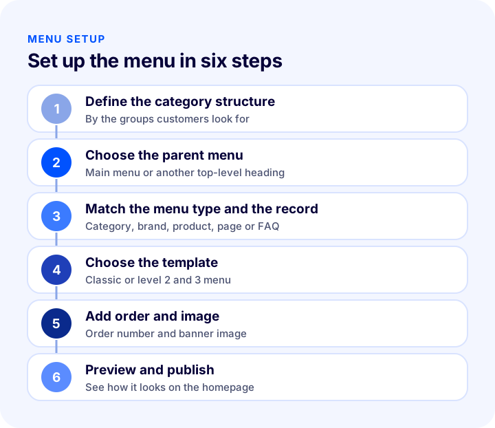
How Do You Create a Menu Heading in Faprika?
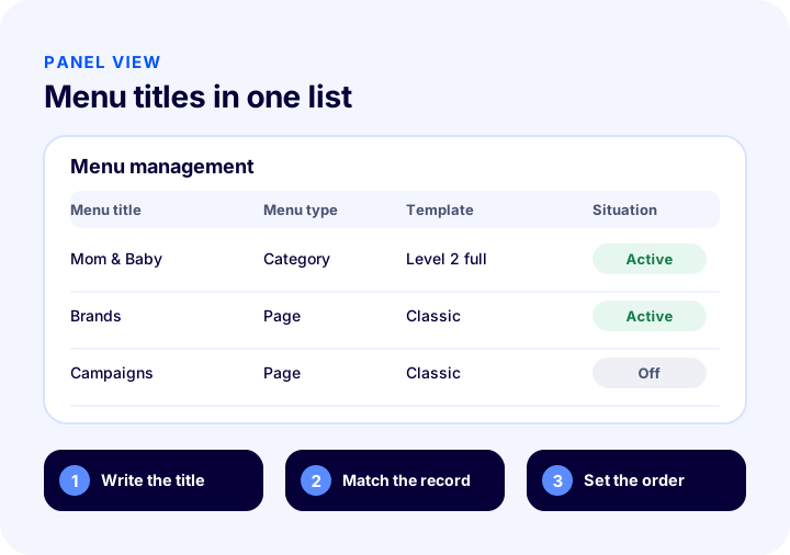
In Faprika, you edit the menu from the Menu Management panel under Content Management in the control panel. The panel lists previously added menu headings; you can search headings, separate active and inactive ones, and sort and edit them. For a new heading, use the “Add New” button at the top right.
How Do You Fill In the Menu Details?
Three choices are made in the menu details area:
- Parent menu: Specifies which parent menu the new heading belongs to. If “Main Menu” is selected, the heading appears in the homepage menu area.
- Menu type: Determines whether the heading is a category, brand, supplier, product, page or frequently asked questions.
- ID: Matches the record that fits the selected menu type. Clicking the magnifier button lists the relevant records; the “Select” button automatically adds the record's ID code to the panel.
How Do You Choose a Menu Template?
If you will use subheadings, choosing a menu template matters. Faprika has five templates, and each displays subcategories differently.
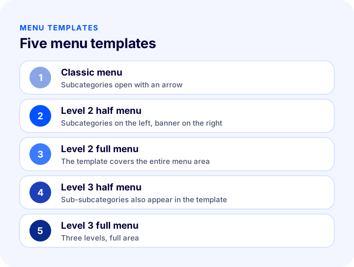
| Template | How does it look? | When is it suitable? |
|---|---|---|
| Classic menu | Categories stacked, subcategories open with an arrow | Simple stores with few categories |
| Level 2 half menu | Subcategories stacked, banners in the right area | Those who want to show a campaign image |
| Level 2 full menu | The template covers the entire menu area | Those who want to show subcategories widely |
| Level 3 half menu | Subgroups of subcategories also appear in the template | Deep catalogs |
| Level 3 full menu | Three levels across the whole menu area | Large stores with many categories |
How Do You Set Menu Direction, Number of Columns and Order?
Menu direction determines whether the menu opens toward the left or the right. The number of columns sets in how many columns subcategories appear; for a heading with many subcategories, increasing the column count shortens the menu. The number you enter in the order field changes the heading's position; the order of both main and subcategories is arranged with this field. Making a heading bold or italic, having it open in a new tab and setting it active or inactive are also done from the same page.
How Do You Add a Menu Image?
If the heading is a main menu item, the “Menu Images” area opens. In this area, you add the banners that appear next to the mega menu by drag and drop or with the “Upload” button. By adding to each image the address of the page where the campaign applies, you can send customers directly to the relevant page. An important detail for SEO: do not write the full address, only the part after the domain name; for example, only the form “/dress/” is entered.
How Do You Deactivate or Delete a Menu Heading?
To hide a heading temporarily, find it in the list and uncheck the “Active” option on the edit page. To remove it permanently, use the “Delete” button in the top right corner of the edit page. Before deleting, make sure the pages linked to that heading can still be found in other ways.
For step-by-step usage with screenshots, see the Menu Management training page, and for category definitions, the Category Management page.
How Do You Manage the Menu in a Multilingual Store?
If you sell in more than one language, menu headings must be written separately for each language. In Faprika, a language can be chosen for a menu heading; the standard and Turkish options serve the same function, English can be selected separately, and for other languages you contact the support team. In each language, write the heading name with the word customers use in that language rather than a direct translation. For everything about setting up a multilingual store, see the How to Set Up a Multilingual E-Commerce Site? Language and Country Selection, URL Structure, Translation Methods, hreflang, Pricing and Shipping Guide, Translation Cost Calculator and Readiness Audit guide.
How Should a Mobile Menu Be Designed?
A mobile menu is not a shrunken desktop menu; it needs to behave differently on a phone. On a small screen, wide dropdown panels take up space, hover behavior does not work and tapping with a finger is less precise than clicking with a mouse. So on mobile, the menu should turn into a simple structure where headings are stacked and each level opens with a tap.
- Headings should be easy to tap: Small, closely spaced headings lead to going to the wrong page.
- Subcategories should open with a single tap: Going back between levels should be easy.
- The search box should stay next to the menu: A customer who cannot find something in the menu should be able to switch to search right away.
- The campaign heading should come first: Because the screen is small on a phone, seasonal opportunities should be placed at the start of the menu.
For the overall framework of the mobile experience, you can also look at E-Commerce Mobile App: What Is It? When Is It Needed, How Is It Prepared and Published? Difference from a Mobile Site, Notifications and App Need Audit. Testing the structure from start to finish on a real phone before publishing reveals many problems that are not visible on desktop.
What Are the Common Mistakes in Menu Structure?
- Adding too many headings: Trying to fit everything into the menu overwhelms the customer.
- Using vague names: Headings like “Other” or “Miscellaneous” do not say what is inside.
- Creating unnecessary depth: Many nested levels make it harder to reach the product.
- Opening a single-product heading: A category with only one or two products under it bloats the menu.
- Forgetting broken links: A menu item pointing to a removed category leads to an error page.
- Ignoring mobile: A menu that looks great on desktop may be unusable on a phone.
- Mixing campaigns into permanent items: When the campaign ends, the menu becomes cluttered; keep seasonal items separate.
Menu Structure Checklist
The list below summarizes the building blocks of your menu layout.
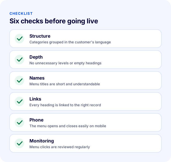
| Stage | Check | Done? |
|---|---|---|
| Structure | Categories are organized in the customer's language and in logical groups | Yes / No |
| Depth | No unnecessary levels, empty items or single-product items | Yes / No |
| Names | Labels are short, clear and free of vague words | Yes / No |
| Links | Every item is linked to the right record; no broken links | Yes / No |
| Campaign | Seasonal items are separate from the permanent structure | Yes / No |
| Phone | The menu opens and closes easily on mobile | Yes / No |
| Monitoring | Menu clicks and search box usage are being reviewed | Yes / No |
How to Manage Menus and Navigation with Faprika
Faprika lets you manage your menu from the panel without writing code. The main options are:
- Menu Management: You add, edit, reorder, activate or deactivate and delete items in a single panel.
- Five menu templates: You choose the one that suits your store from Classic, 2nd level half and full, and 3rd level half and full templates.
- Six menu types: You can link an item to a category, brand, supplier, product, page or frequently asked questions.
- Menu images: You can show campaign banners in the mega menu and give each one a destination page URL.
- Direction, column and order settings: You set the opening direction of the menu, the number of subcategory columns and the order of items.
- Language selection: You can write menu labels in each of your store's languages.
You can see which features are included in which plan in the e-commerce plans comparison.
We recommend readingHow Should an E-Commerce Product Page Look? 15 Elements of a Product Page That SellsFrequently Asked Questions
What should the menu structure of an e-commerce site look like?
The menu should be built around how customers would group products; headings should be short and written in the customer's language, levels should be kept limited and the most important categories should come first. The menu must also be easy to use on a phone.
How many categories should a menu have?
There is no single right number; it depends on catalog size. The criterion is that the menu stays scannable at a glance. If a customer opening the menu cannot tell what to choose within a few seconds, there are too many headings.
When should a mega menu be used?
A mega menu suits stores with many categories and subcategories, and those that want to highlight campaign visuals in the menu. In a store with few categories, a classic menu is simpler and faster.
Does menu structure affect SEO?
Yes. The links in the menu show search engines which pages are important, and because they receive links from every page, those categories accumulate value. It also helps when heading names match the words customers search for.
How do you edit the menu in Faprika?
From the Menu Management panel under Content Management in the control panel. With Add New, you create a heading, choose the parent menu and menu type, match the record by ID, and set the template, direction, number of columns and order.
How do you deactivate a menu heading?
Find the heading in the menu list and uncheck the Active option on the edit page. The heading is hidden without being deleted and can be re-enabled whenever you want. To remove it permanently, use the Delete button at the top right.
You May Also Like
- How to Do Category Page SEO: 12 Steps to Move E-Commerce Category Pages Up the Rankings
- How to Sort Products in a Category? Sorting by Best Sellers, New Arrivals, Profit Margin and Stock Status, Out-of-Stock Products, Season and Campaign, Filter Relationship, Measurement, Sorting Impact Calculator and Layout Audit
- E-Commerce Homepage Design and Showcase Management: How to Arrange the Homepage Showcase? Sections, Ordering, Mobile, Speed and Campaign Calendar: A Practical Guide, Click-Through to Product Calculator and Homepage Audit
- How to Set Up a Multilingual E-Commerce Site? Language and Country Selection, URL Structure, Translation Methods, hreflang, Pricing and Shipping Guide, Translation Cost Calculator and Readiness Audit